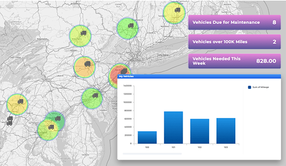
Monitor & Optimize Jobs in Real-Time
- How To Guide
- Monitor & Optimize Jobs in Real-Time
Have you ever had to turn down a new customer because you thought you were booked solid, only to find out later that you had a service agent nearby who could’ve taken the job? Or maybe you’ve been caught in that frustrating moment when a critical decision about a customer or job took too long, costing you time and money.
It’s time to stop missing out on business because you don’t have a clear view of what’s happening in the field. Get an instant snapshot of all your job locations, team activities, and performance metrics right at your fingertips, anytime you need it.
Visualize every job location, track key stats, monitor team availability, and keep tabs on customer satisfaction—all in real-time and all in one place. The best part? It’s all automated, so you can focus on what matters: making smart, fast decisions that keep your operations running smoothly.
Ready to streamline your decision-making and optimize jobs on the fly? Let’s dive in and see how you can take on more business than ever before without adding a single extra service agent.
AUTOMATE YOUR DATA ENTRY
Manual data entry can be one of the most time-consuming and error-prone aspects of managing a field service team. Let’s automate your data collection process, ensuring that you always have up-to-date and accurate information without the need for constant oversight. This is a key step to ensuring ongoing job monitoring and real-time updates.
First, click the Mapline logo at the top-left of your screen and select NEW FORM. Name your form JOB REPORTING and click OK. Now, your new form is ready to customize! Add questions to your form to collect details about each service visit, such as:
- Brand name
- Point of contact
- Date of service
- Service type
- Job status
- Additional service needs
- Customer signature
- Photos of service provided
Then, configure your form submit settings to collect important metadata, such as precise location and time stamps, who submitted the data, and… This is a fantastic way to ensure that you always know which jobs were completed and when, and you have a solid paper trail to back up your analytics.
It’s also important to customize your form submit settings to save your data to the correct location–ideally, your existing job dataset. We’ll use this data on the dashboard you’re about to create.
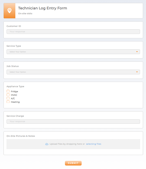

Pro Tip: For the purpose of this tutorial, go ahead and fill out your form with some dummy data. This way, you can easily set up your analytics and automations with the dummy data, and everything will be ready to go when your team starts filling out the new form!
CREATE A JOB DASHBOARD
To succeed, you need the right information at your fingertips on demand. With a well-organized job dashboard, you can consolidate everything from job locations to team performance metrics in one place. This dashboard becomes your command center, allowing you to monitor operations in real-time, make informed decisions on the fly, and ensure that no opportunity slips through the cracks. Let’s get your dashboard set up so you can start running your team like the superhero you are.
Click the Mapline logo at the top-left of your screen and select NEW DASHBOARD. Name your dashboard JOB TRACKING and click OK. Now, your new dashboard is ready to customize! Here are some powerful ways to capitalize on your dashboard:
MONITOR YOUR JOBS
See every job location, status, and update in real-time without sifting through endless reports or spreadsheets. By adding your job locations to the dashboard, you can visualize the geographic distribution of your team’s work and spot potential issues before they become problems. Whether it’s a delayed job or an unexpected change in a technician’s availability, your dashboard keeps you in the loop, allowing you to respond quickly and keep your operations running smoothly.
Click the ADD menu, hover over MAP, and select FROM MAP LIBRARY. Select your map of job locations and click OK.
Now, your map has been added to your dashboard, giving you the power to monitor your jobs, team performance, and analyze your audience.
TRACK TEAM PERFORMANCE
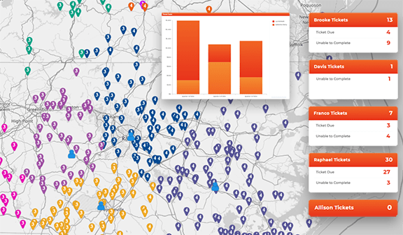
Your team is the backbone of your operations, and understanding how they’re performing is crucial to maintaining high standards. With performance metrics integrated into your dashboard, you can easily track key indicators like job completion rates, average response times, and customer feedback.
It’s time to take advantage of the form you just created. Expand the sidebar on the map you just added to your dashboard, click the pin layer containing your job locations, and select SEGMENT.
Here, you can easily segment your jobs by status. When you collect this information in your JOB REPORTING form, you can easily segment your locations and hone in on areas that need your attention. When you’re finished configuring your segmentation settings, click OK to apply your changes.
If you want to really hone in on specific KPIs, such as outstanding jobs or unscheduled appointements, add custom metrics to your dashboard so you always have a high-level overview of your operations.
PINPOINT HIGH-DEMAND AREAS
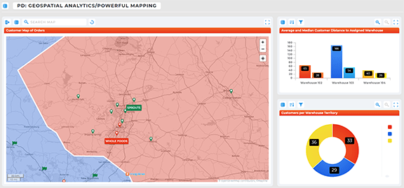
Knowing where your services are most in demand can be a game-changer for resource allocation and business growth. By identifying high-demand areas, you can focus your efforts on the regions that need the most attention, optimizing your team’s efficiency and boosting customer satisfaction. A dashboard that highlights these hotspots ensures you’re always deploying your resources in the most strategic way possible.
Click the pin layer containing your job locations and select HEAT MAP. Select HEAT ON LOCATION DENSITY, customize your heat map settings, and click OK to apply your changes. By adjusting the settings to highlight regions with the highest concentration of jobs, you can easily see where demand is peaking.
Now, your map is all set to auto-identify areas of expansion and areas needing attention, allowing you to optimize your operations for success!
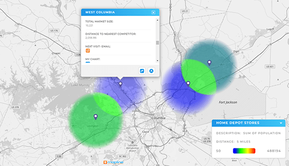
CREATE LOCATION-SPECIFIC CHARTS & REPORTS
Every region you serve has its own unique challenges and opportunities, and a one-size-fits-all approach doesn’t always cut it. That’s where location-specific dashboards come in. By creating tailored dashboards for each individual business location, you empower your service team to understand each customer better, see historical job details, and deliver top-notch service across the board.
Click the map layer containing your job locations and select VIEW DATA. Click the ADD CONTROL icon in the top menubar and select VISUALIZATIONS. Name your new dataset column SITE DATA, select either CHART or REPORT as the source type, and configure your visualization column settings to generate the data you want to see.
Then, share a view of this dataset with your team, ensuring that everyone has access to the data pertaining to the locations they’re assigned to.
This gives your team insight into key information about each location they service, enabling them to make informed decisions that keep your operations running smoothly and your customers happy.
