ADD METRICS
- How To Guide
- ADD METRICS
If you’ve built a Mapline dashboard, you understand the convenience of having all your visualizations in one place. But sometimes, you just need a quick glance at key performance indicators (KPIs) like year-to-date (YTD) sales or upcoming deliveries. That’s where metrics come in handy!
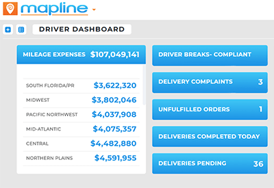
For instance, suppose you’re monitoring delivery timeliness. Metrics provide an instant, up-to-date summary of this data, allowing you to assess it at a glance whenever needed. Here’s how it works.
ADD METRIC
To add a metric to your dashboard, click the ADD menu and select METRIC > CREATE NEW.
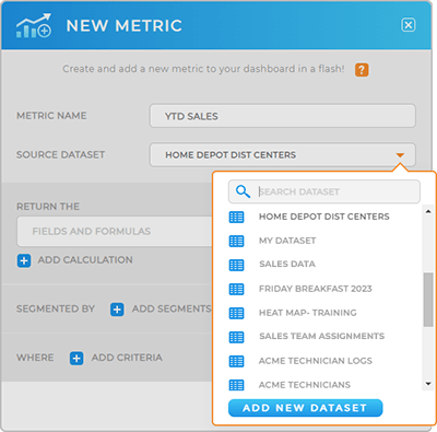
Name your metric and select the source dataset (use the search bar to quickly find the dataset you need).
Next, we’ll dive in to how to configure your metric formulas. These are the calculations that determine which KPIs show up on your dashboard.

CONFIGURE METRIC
Now, we’ll write the formulas that determine which data gets pulled into your metric.
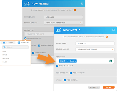
Just click the blue plus sign that reads, ADD CALCULATION, and click the tab you need:
- Columns: select the dataset column(s) containing the data you need
- Formulas: choose the formula you need, including PLUS, MINUS, MULTIPLY or DIVIDE
You’ll see that your columns and formulas appear in the RETURN THE window. From here, you can fine-tune your calculation to generate the precise output you need.

Next, click the blue drop-down inside your formula to select from the following types of calculations:
- Sum: Total sum of a set of values
- Average: Mean value
- Median: Middle value
- Maximum: Highest value
- Minimum: Lowest value
- Count: Total number of values
- Count of Unique Values: Total number of distinct values
- Product: Result of multiplication
- Standard Deviation: The amount of variation or dispersion in a set of values from the mean, indicating how spread out the values are
- Standard Deviation of Population: Similar to standard deviation but calculated for an entire population rather than a sample
- Variance: Quantifies the spread of data points by calculating the average of the squared differences from the mean
- Variance of Population: Similar to variance but calculated for an entire population rather than a sample
Once you’ve applied the correct formulas, you can apply segments and filters to further fine-tune your output.
When you’re finished, click DONE to create your metric.
ADJUST APPEARANCE
Customize the appearance of your metrics just like you would for any other dashboard item. This allows you to present data in a way that best suits your needs.
Whether you need a detailed breakdown of individual data points or a high-level summary of overall performance, adjusting the size and layout of your metrics ensures that you can quick access to the most relevant info.

EDIT METRICS
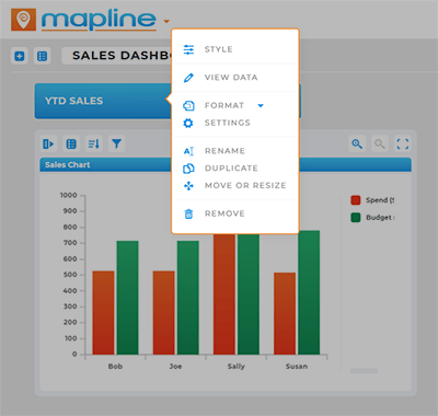
As business priorities evolve, so too must your metrics. It’s easy to update formulas, rename metrics, or adjust formatting options–just right-click your metric and select from the following options:
- Style: Adjust your font, text size, font color, and background color
- View Data: View the data behind your metrics
- Format: Choose how your metric numbers appear: as plain text, or a number, percentage, currency, date and time, or timespan (minutes, hours, etc)
- Settings: Adjust your metric settings, including formula configurations
- Rename: Quickly rename your metric
- Duplicate: Duplicate this metric on your dashboard
- Move or Resize: Move and resize your metric on the dashboard
- Remove: Delete this metric (cannot be undone)

LEVERAGE METRICS
From tracking sales performance to optimizing logistics operations, metrics offer invaluable insights that empower businesses to make data-driven decisions with confidence. Here are some common ways other brands get the most out of their metrics:
- Embed dashboard on a webpage for your team or shareholders
- Share dashboard and metrics with your team
- Import metrics to other dashboards


