Close
WE'RE ALL ABOUT
YOUR
SUCCESS
HOW WOULD YOU LIKE TO GET IN TOUCH:
Email
Email
Calendar
Cal
Close
WE'RE ALL ABOUT
YOUR
SUCCESS
HOW WOULD YOU LIKE TO GET IN TOUCH TO SCHEDULE YOUR DEMO:
Email
Email
Calendar
Cal
Mapline - mapping made powerful Close
Give us a call. We'd love to talk!

+1 800.969.1454

Close
Close
Geo Mapping Starter Close

Experience the power

Get ready to see your data in a whole new way!

Author: Mapline

Mapline Releases Easy Mapping Video Tutorials

Mapping makes even simpler as Mapline releases new tutorial videos. We believe that our users will find these tutorials very informative for easy mapping within a minute – even less!

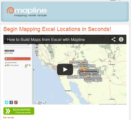
How to Build Maps from Excel with Mapline

This is a 3-minute step-by-step tutorial video that showcases how to easily create a map in a minute. It also explains the important icons in the sidebar and on the map for easy mapping.

Showing Labels

In 16 seconds, viewers can learn how to identify information from each map point. They also learn how to display the name or the bubble info of each marker.

Measure Distances on a Map

Got 34 seconds? Then you can find value in this video on how to use distance measuring tools using the draw pad.  You’ll be amazed to learn how to draw lines between 2 map points and very quickly see the distance between them.

Build Custom Territories on a Map

We are always asked In 26 seconds, viewers can learn how to create a map with customized territories using the draw pad.

Coverage Overlay Maps

This video is just 22 seconds and it shows the use of  coverage overlay. Many companies found this helpful as they learn to easily identify their network coverage. Different industries can take advantage of the simplicity of this mapping feature like retail, insurance, healthcare, real estate, and others.

Mapping Custom Color Pins

Within 25 seconds only, Mapline users can learn how to customize color map markers. This is very helpful when they want to show 2 or more datasets on a map. Users can  customize their map pins with their preferred shape, size, color and stamp. They can also upload an image to use as map pins.

New Feature: Territory Layer Icon

Do not be deceived! This small icon can do wonders. And by that we mean REALLY wonders!!! The territory icon works in mysterious ways.
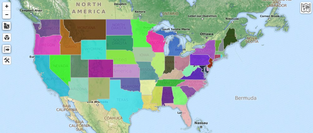
Here in Mapline, it wouldn’t be called “mapping” if it isn’t simple. So, we designed this new feature to help users use territory sets in the simplest way as they create a territory map. In just a minute, your map can look like this:
Truly, the tiny icon brings massive results!

Mapline’s New Look 2014

“Out with the old, in with the new” seems to be the the new stand of Mapline. Recently, the mapping website that provides the simplest tools, made a lot of changes and added awesome features to make data visualization more captivating and informative but still using the simplest ways so users can experience the easiest mapping on the planet! Mapline's New Look 2014 Let’s check some of the great features that can now be seen in Mapline. This will enable the users and website visitors to view the “face lift.” We decided to add a “Watch a Demo” link. The 3-minute video aims to help visitors to create a map easier.
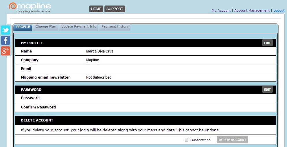
Once logged in, the user will automatically view their maps with options to add a new map or new data set. We thought that users use our mapping software because of one thing – to map! There is no better way to start the process than leading them directly to a page showing a full list of their maps. Another noticeable change is that the “Maps” category is divided into 2: the maps that you created and the maps that were shared with you. This is designed so that once you received an email notification about a shared map, you can quickly view it on the “Maps Shared with Me” tab. So you don’t need to browse from the list of all your maps to look for that particular shared map. The “My Account” page has its share of “face lift” as well. Interestingly, the new look makes it easier for users to check their account using the 4 tabs: Profile, Change Plan, Update Payment Info, Payment History. The “Profile” tab should be used when users would like to change their password or delete their account.
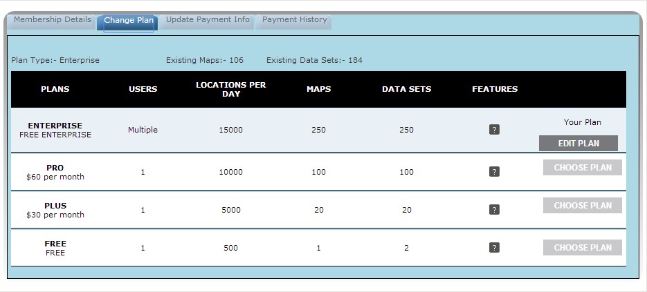
The “Change Plan” tab is used when users would like to change their plans or to edit their plans (for example, from monthly membership to annual membership).
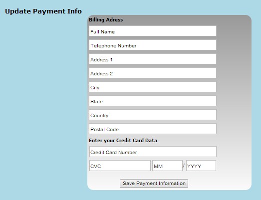
The “Payment Information” tab is used to add or update CC account information.
Finally, the “Payment History” is used if the users would like to check the payments they have made for their account.
We’re positive that the new Mapline look will transform our users’ easiest mapping experience from simply good to simply awesome!

New Feature: Find Distances Between All Locations

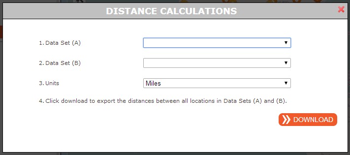
More great news! Now you can export the straight-line distances between all locations in two different datasets. Distance calculations are now provided by Mapline. Users can just enter the datasets and then choose which distance metric they want to use (miles or kilometers).   Once datasets are entered, you can download a distance grid spreadsheet showing the distances between all the locations of two datasets.
New Feature: Distance Grid

New Feature: Draw Pad to Draw Shapes and So Much More!

From the past, we received a lot of customers’ requests of having a feature where they can draw a line between locations. We are excited to announce that Mapline has finally rolled out a draw pad.
This feature will allow the users to draw a ruler-type line and so much more! Here are some of the things that users can do with this feature:
  • Draw lines from one point to another. The map will show the distance between the two points.
  • Draw a circle or a rectangle around a certain point. The map will show the mile radius of the circle.
  • Change Color
  • Draw a Polygon
  • Draw a Circle
  • Draw a Rectangle
  • Put map marker on an area without adding another dataset for that specific area.

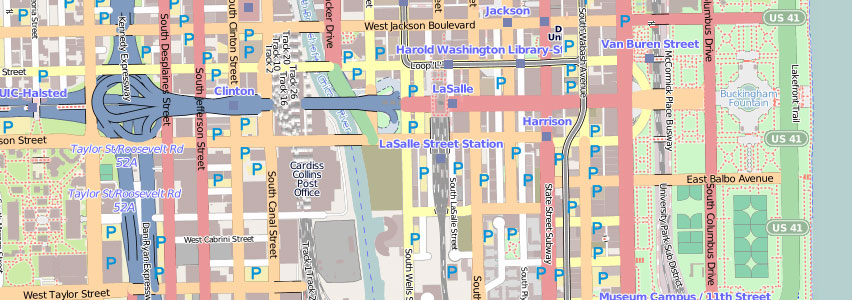
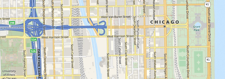
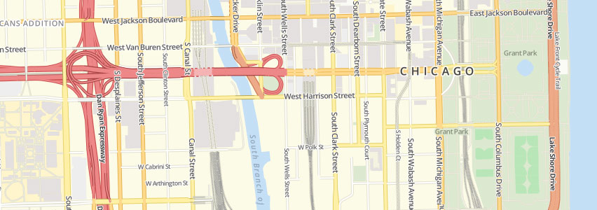
New Feature: More Mapping Styles

In Mapline, we understand that our users have specific mapping needs. We all do, right? Birds can fly and get directional views from above. But hey, we’re humans and so we stick to using the best tool possible to give us directions: mapping! For better viewing and so much easier to understand, we have developed a new styles in mapping – OpenStreetMap, MapQuest, and OSM Bright. The new mapping styles are particularly helpful as they bring a sensible starting point for quickly making powerful maps. Check out these styles and brace yourself to have a new mapping experience!