
Identify Trends in Tourism Industry using The Bahamas District Map
Analyze Location Data Better with a District-Level Map
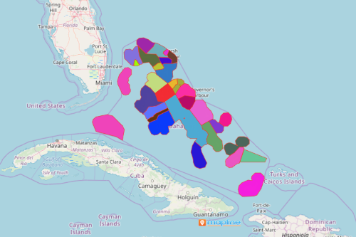
A growing number of organizations in the tourism industry rely mostly on The Bahamas district map for their data analysis. The Bahamas is an archipelago that is made up of 700 islands, cays, and islets. Its economy is mainly based on tourism. Hence, a district map is useful in analyzing location data in tourism business. Moreover, adding an Excel spreadsheet of locations on a district map helps identify trends and emerging needs in the industry. Additionally, the map shows if district areas are bound to succeed or fail in tourism-based initiatives.
Territory heat maps are used to explore new ways to boost the tourism industry. The goal is to simplify analysis so that there will be more time spent in applying actionable insights.
Mapping District Boundaries Enhances Data Analysis
With a district-level map, there is no need to spend sleepless nights combing through Excel rows and columns. A data-driven district map results in an awesome data visualization that helps you see patterns and trends that will help in your business decisions.
- Create a Mapline account and login.
- Click the orange “Add New Items” button.
- Select “New Map” on the drop down arrow.
- Give your map a name and click “OK.”
- Click the “Add” button from the left sidebar.
- Select the “Territories” option.
- Click “From Mapline’s Repository.”
- From the “Territories” select “The Bahamas Districts.” You can also enter that on the search bar.
- Select how you want your boundaries to be colored in “Fill Color” (Random Colors, Uniform Color, Dynamic heat map colors, or Custom colors from spreadsheet).
- Click “OK.”
Sign up now and let our mapping tools help you gain more insights by to identify data patterns and trends.