Close
WE'RE ALL ABOUT
YOUR
SUCCESS
HOW WOULD YOU LIKE TO GET IN TOUCH:
Email
Email
Calendar
Cal
Close
WE'RE ALL ABOUT
YOUR
SUCCESS
HOW WOULD YOU LIKE TO GET IN TOUCH TO SCHEDULE YOUR DEMO:
Email
Email
Calendar
Cal
Mapline - mapping made powerful Close
Give us a call. We'd love to talk!

+1 800.969.1454

Close
Close
Geo Mapping Starter Close

Experience the power

Get ready to see your data in a whole new way!

Author: Mapline Team

2015 Mapline Voyage

We came, we saw, and  yes, we so conquered 2015 with flying colors! Thanks to all of you, our valued Mapline customers and users, because you made another mapping year with us truly awesome! 2016 is just around the corner – yup, another meaningful year peeking at a distance. But for now, we thought it would be nice to reflect back on some of the best accomplishments of Mapline for the past 365 days. 2015 Mapline Voyage Here are some of the ways you made the difference in mapping with us: These will not be possible without your continuous feedback and allowing us to help you achieve your mapping goals. What’s in store for Mapline in 2016? We can only expect better victories ahead for all of us. And we can’t wait for all that we have in store for this year. So bring it on, 2016!

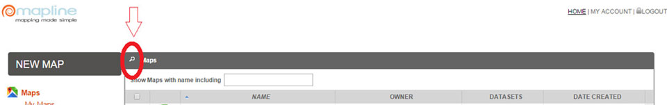
New Feature: Sublayers Work Wonders!

In line with mapping in simplicity, we are proud to release a new mapping tool that puts the “A+” in data analysis. We’re talking about Sublayers. Though the name isn’t as cool as its abilities, we tell you – they bring huge analytical power to the users! Just by a few clicks, it can answer difficult questions such as:
  • How can I identify a particular group of pins?
  • Where are my retail stores with the highest sales located?
  • How can I analyze a particular group of pins with the rest of the pins on my map?
  • How can I create a multi-layered map from my data set?
The answer? The Sublayer feature! It makes mapping simpler while trimming your analysis down in only minutes. How cool is that? Here’s how it works. See the map below? Here, you’re shown a map with crowded pins. Does that mean anything? Not in the first glance. Yes, the map does say something about the locations and the pins represent addresses. But if you really want to know the connections between thse map pins, you need to re-group them by category. Thanks to the new feature, you now have the power to organize your map pins and make your data analysis much less trickier.
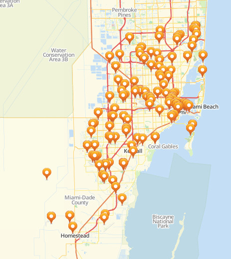
When the sublayers feature is applied using “Unique Values,” here’s what you can get. The map pins are categorized on their status – Open or Closed. Notice that the map pins by sublayer also changed so you can easily identify which is which. At the left sidebar, you can also see how many pins are in closed status and how many are in open status.
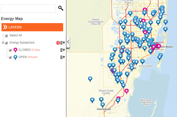
For further solutions, feel free to use the Custom Groups selection. It will open new ideas as you step in and categorize your pins in different layers. It is also a vital tool to create exceptional map visualizations for presentations. Show your audience the different tiers of dataset that affects your business.
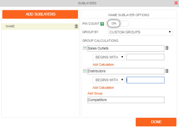
Regroup your data and create a three layer map showing your customers addresses, distribution centers, and competitors. Since each group is represented by unique pin colors, relationship between the groups can be easily identified. Here’s a map using the Custom Groups where you can create different groups and add calculations.
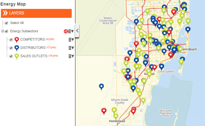
Mapping Made Easier with Mapline’s New Homepage

“There’s no place like home.” Or so goes the saying. And if the home gives you all the things that you need, who needs to go out? At Mapline, we would like to give our users the friendliest “home” to add more value to their mapping experience. Since the first stop is the Homepage, we thought it would be best to do some “renovation.” Additional features were added not only to look more appealing but more so to give our users the enhanced usability of functions. Here are the new changes that you will notice. What’s even better is that they’re available to use now!

Search Button

Click the search button and  start typing the name of the map or dataset that you’re looking for. Even if you type in just 2 or 3 characters, the system will provide you options to choose from.

Organize Column

Now, you can sort each column by clicking on the column header. Click each column and the triangle will appear to help you sort out the list. For instance, map names can be arranged in alphabetical order (or reverse). Date created can be organized in chronological order (or reverse).

Duplicate Button

There’s a new option – Duplicate – which is very helpful. For example, you would like to test adding different radius circles on your map but at the same time, you would also like to retain the original map. What can you do? Just click the box of the map that you want to duplicate. Hit duplicate and automatically, the map is duplicated. The copy can be found below the map that was duplicated. We hope that the newly added features will help you be comfortable in your new home. For any suggestions, don’t hesitate to drop us an email.

Mapline Introduces Radial Heat Mapping

Perform Radial Map Analysis with Mapline

Another reason for Mapliners to shout for joy! Radial heat mapping allows for even more in-depth analysis. Radial heat mapping is often associated with weather forecast. But that’s not all. This is another intuitive way to represent geographical information density according to color. Geographical locations data can also be heat mapped using this feature. Organizations have been asking us to add this feature as radial heat maps can help them track their marketing program impact. Anyone who wants to visualize a geo-spatial element’s size by radius derived from a data field will be thrilled to get their first radial map created. When you look at the map above, it will show color coded concentrations of the data. So in a way, just by looking at the radial mapping software, map users can identify where the more condensed areas of data are located (as shown by red color) and less condensed areas (in blue) and varying degrees of colors in between (green, yellow, orange, etc). The radial heat mapping software is easy to use. When you add a layer to a map, you will notice a heat mapping icon next to the layer (on the left sidebar) that will enable you to apply the radial heat mapping options. Try out radial heat mapping with your data – learn about how the different settings work.