Close
WE'RE ALL ABOUT
YOUR
SUCCESS
HOW WOULD YOU LIKE TO GET IN TOUCH:
Email
Email
Calendar
Cal
Close
WE'RE ALL ABOUT
YOUR
SUCCESS
HOW WOULD YOU LIKE TO GET IN TOUCH TO SCHEDULE YOUR DEMO:
Email
Email
Calendar
Cal
Mapline - mapping made powerful Close
Give us a call. We'd love to talk!

+1 800.969.1454

Close
Close
Geo Mapping Starter Close

Experience the power

Get ready to see your data in a whole new way!

Author: Mapline Team

New Updates

What a great way to start the year! As we stay true to our commitment to make mapping simple, we’ve rolled out another set of updates to make your mapping experience simpler while making it more fun! You asked and we listened. Now, it’s time for you to sit back and watch how these new updates can help you with your mapping:

Dot Density

This new addition reveals where locations are clustered. Many users have been asking for this feature because this is especially useful when mapping locations or phenomena that change dramatically over an area. 7-11 Dot Density

Ability to Save Column Widths on Spreadsheet Page

You can now slide the ruler of the columns in any way you want and it will be saved. When maps are shared, those whom the maps have been shared with will also see the saved column widths of the spreadsheet. save column width

Ability to Delete Selected Rows from a Dataset

We’ve made it easier to delete locations from your datasets. Now you don’t need to click the locations one by one to delete them. Just click the rows that you want to delete, click the “Selected rows” on the drop down arrow of “Delete” button and bam! Your locations will be deleted all at once. delete selected rows

Added Support for Degree Formatted Coordinates

Mapline can now support decimal and degree coordinates.

Miscellaneous Bug Fixes

There are a few bugs that we captured and fixed. We thank you all for your feedback and queries. If not for them, we would not be able to make these updates successful. Let us know if you have more suggestions. We are open to feedback. What else would you like to be simpler to accomplish while mapping with us?

V5 Update Summary

If we were to sum up the year 2016 in one word, it would be “change.” Yes, a lot of changes happened this year, changes that best suit you, our dear Mapline users. We are committed to continuously add more features to the application that will help our users find fast results in mapping. So what have we been up to for the past few months?

Mapline’s V5 Update Takes Simple to a New Level

What better way to improve than to remain true to our name – Mapline. Hence, we find that simplicity is essential in creating a powerful data analysis tool. The simpler it is to use, the better the results of your decisions. With simplified navigation, we can make mapping and analysis become entrenched within your organizations. Here are some of the changes in our V5 update that add up to the new “look” of Mapline:
  • What’s New Link – In just one click, you can see the features/changes that were recently added. This is a great addition since you will be informed of the changes before you actually start mapping.
whats-new2
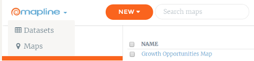
  • Menu in the Logo – As you click the Mapline logo, you will see the Datasets and Maps options – so you can quickly jump right into mapping!
v5-update-menu  
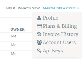
  • Profile options in top right menu – Need to change something on your profile? Just click your name at the upper right corner and click “Profile.”
whats-new4
  • Home and Account pages are mobile-friendly – With more and more users reviewing their accounts using their hand-held devices, we’ve optimized more of our site for mobile-friendly viewing and navigation.
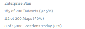
  • Plan limits and geocoding limits display on bottom left – Here’s a summary of your plan limits so you would know what has been consumed and what are the remaining limits – strategically located to keep you informed.
v5-limit-summary
  • Messages appear when logging in – >After logging in, a message will appear at the bottom of the page – be it a reminder, a tip or a suggestion.
  • Simplified navigation menu – Need I say more?
  • Your Data Stays in its Original Format – Previously, the order of your columns and your column headers could be changed when they were uploaded. Now, your data will be preserved exactly as you uploaded it both in the spreadsheet view and in the bubble on the maps.
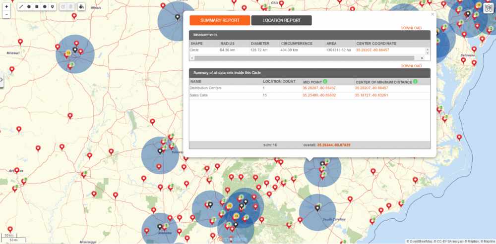
  • Territory Reports to our Coverage Overlay Feature – Now instead of having to draw custom circles around each pin to get a territory report, you can use the coverage overlay to do it for you. Then you can click on whichever location you want to get a report for, and Mapline will show you all data within that coverage area.
whats-new-coverage-overlay-report

Take Features from Good to Great

We’ve seen a shift this year as we continue to develop features and make changes so that you can create actionable insights from your data while making your mapping more useful. So be on the lookout for more updates to our current features in 2017.

What to Expect in 2017

As 2016 comes to a close and 2017 gets under way, you can expect more changes for the better. As a trusted name in mapping, Mapline will continue to uphold on the high value of giving you the simplest and best mapping experience in the coming year and beyond.

3 Reasons Why Simple Matters for Data Visualization

At Mapline, we’re proud to say we have the easiest mapping software on the planet. You simply create an account with us, paste your Excel spreadsheet into our software and watch as it gets transformed into a powerful map you can use for data visualization – all in seconds! Sure, there are Mapline alternatives out there – so why does our simple approach beat out the competition?
  1. Simple territory mapping software lets you do your job more efficiently. The less time you’re spending manually plotting data or trying to understand difficult software, the more you’re able to focus on what you actually need to be doing, which is analyzing the data at hand and making decisions based on your findings. Territory mapping software and data visualization should make your job easier, not add more complications to the mix.
  2. Your brain power is freed up for more important things with easy mapping software. There’s only so much multi-tasking one person can do before it stops being a useful skill and instead slows you down. With Mapline, you aren’t distracted by a difficult program. In fact, our software takes little thought to use – just copy and paste your data and your map is created for you. Add and remove filters as needed to get a quick understanding of your data.
  3. No one stays still anymore – simple makes analysis on the move easier. With Mapline’s digital mapping software, you can take your data visualization with you on the road. If you’re in the field, perhaps working out of your vehicle on a particular day, the last thing you need is a clunky program slowing you down. Pasting your Excel data into Mapline is easy when you’re on the go.
Ready to analyze your data? Discover Mapline’s features, how we help those in your particular industry and our plans and pricing so you can get started now.

New Features – Radius Mapping and Replace Dataset

Check Out the New Features to Our Online Mapping Software

Mapline is already the simplest mapping software on the planet, and now we’re introducing another batch of new features that will surely empower you to make mapping even simpler! Find out about how you can draw a radius circle on a map as well as how to replace a dataset with new spreadsheet data.

Creating a Radius Map

Radial Heat Mapping: Create a Radial Map 
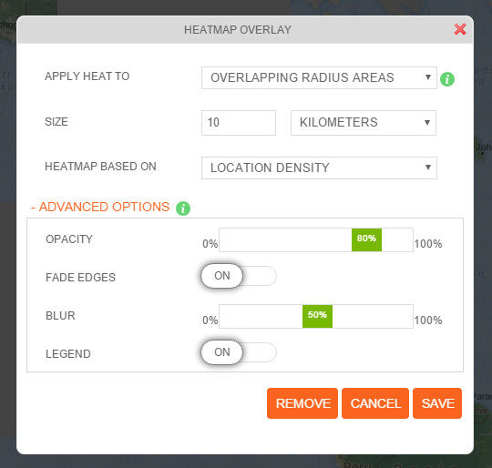
There are now 2 ways to create a radial heat map. To heat map:
  • Areas around pins – this allows you to quickly identify pins that are clustered together. This is the best heat mapping option to use if you want to understand accounts with large numbers of sales or customers.
  • Overlapping radius areas – this new type of heat map option enables you to identify areas with high density. This is highly recommended if you are looking for the right location for a new business, or if you want to know the high risk areas when planning for disaster management and recovery.
Find more information about viewing a radius circle on a map as a helpful heat map.

Replace DataSet

Replace Data Set 
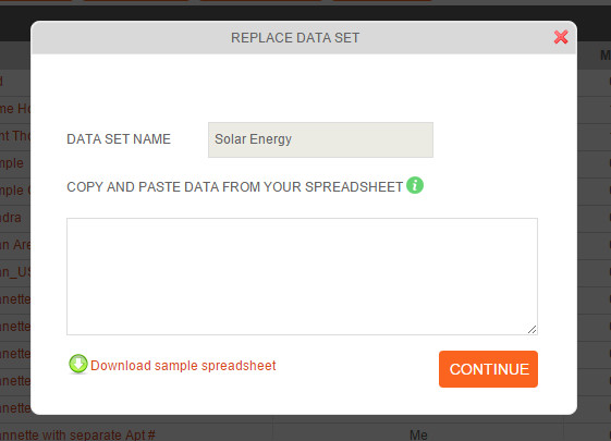
This new feature allows you to remove the dataset and replace it with a new spreadsheet data. This is usually used in situations where you are frequently changing the datasets of your maps. There are 2 ways to replace your dataset.

First Option:

  1. Open your map.
  2. Click the drop down arrow beside the dataset.
  3. Choose “Edit Data” link.
  4. Click “Replace” tab located on top of the page.
  5. Copy your new spreadsheet data and paste it to the box provided.
  6. Click “Continue.”

Second Option:

  1. Click “My DataSets.”
  2. Check the box beside the data set that you want to replace.
  3. Click “Replace” tab located on top of the page.
  4. Copy your new spreadsheet data and paste it to the box provided.
  5. Click “Continue.”
Now that’s making mapping even simpler! They are now available to use. Go ahead, try them and see where your new mapping experience will take you.

New Feature: English Names for Foreign Territory Boundaries

So you want to map territories in a foreign country. Using a mapping software, you were so excited to start creating one. In minutes, you have your map ready – only to find out that you can’t understand the names of the territory boundaries because what’s showing is the local names and characters instead of the English names. How frustrating! Mapline is excited to announce a new enhancement that will make mapping more convenient and at the same time giving you less headache when it comes to reading territory names. We now bring you a feature where you can choose how to view your map – with Multilingual names or with English names! For example, when mapping Japan territories, your map would look from this: japan-local … to this: japan-english

How to Use The New Feature

When creating a map, your map labels will appear in English by default. Easily choose from the top right corner the following selections:
  • Original (English)
  • Original (Multilingual)
  • Bright
The new feature will enhance not only the readability of your map. More than that, it will help speed up map analysis and data understanding. Try using the new feature now!

Custom Territory Mapping with Mapline

Mapline offers a lot of fantastic features to help you analyze your Excel location data. One of these features is territories. With Mapline, you have the option to use a multitude of existing territories as well as creating custom shapes on your map. Want to understand the advantages of each of these methods? We’ve got you covered.

Available Existing Territories – How to Use Territory Mapping Software

Mapline offers territories for dozens of countries, from Afghanistan to Zimbabwe and everything in between. You’re able to select your chosen country or continent and narrow down from that level. Examples of existing territories include: Australian local government areas, postal codes, states and territories and suburbs; China provinces; UK counties, countries, postcode areas, postcode districts and regions; and US zip codes, Census tract maps, congressional districts, area codes and school districts. Find a full list of Mapline’s available territories here. As you can see, territories vary widely. Using our existing territories is best when you want to analyze your company’s location data in relation to your customers’ own lives and reality. For example, if you want to understand demographic factors associated with customers, you might plot customer addresses and overlay a territory as broad as states or as granular as US Census tracts to view distinct groups of populations and analyze their behavior.

Draw on a Map for Custom Map Making

If, however, you wish to analyze data based on your company’s own indicators, you can use our custom territory mapping to draw a circle on a map (or square or other shape – including irregular shapes) to represent your internal boundaries or delineated sales territories. You’re also able to click on your shape to then see a list of all the addresses located within the shape. This feature is especially helpful for analyzing sales territories to determine reps’ workload and distribution of both clients and sales personnel. And there you have it – when to use existing territories and when it’s best to draw on a map to create your own custom shapes. It’s that simple! Want to know what else you can do with Mapline? Browse our features.