Close
WE'RE ALL ABOUT
YOUR
SUCCESS
HOW WOULD YOU LIKE TO GET IN TOUCH:
Email
Email
Calendar
Cal
Close
WE'RE ALL ABOUT
YOUR
SUCCESS
HOW WOULD YOU LIKE TO GET IN TOUCH TO SCHEDULE YOUR DEMO:
Email
Email
Calendar
Cal
Mapline - mapping made powerful Close
Give us a call. We'd love to talk!

+1 800.969.1454

Close
Close
Geo Mapping Starter Close

Experience the power

Get ready to see your data in a whole new way!

How to Create a Heat Map

What is a heat map and how can it help you dive deeper into your business analytics? A heat map is a color-coded representation of your data. Different color gradients represent various values and ultimately give you a clear snapshot of otherwise complex information. With Mapline, learning how to create a heat map from Excel spreadsheet data is easy. You can find out where customers, sales and marketing opportunities, or distribution centers are concentrated on a map. Follow these 8 simple steps to learn how to create a radial map:
  1. Open your map.
  2. Click the drop-down menu next to your dataset.
  3. Select “Heat Map.”
  4. Select whether you would like to apply the heat the area around the pins or the overlapping radius areas.
  5. Define the radius (i.e. miles or kilometers).
  6. Select whether you would like the heat map to be based on location density or the sum or average of your data.
  7. Click on the “Styling” tab to set the opacity and blur. You can also remove the legend and fade the edges of the heat map.
  8. Click “OK.”

Tips for Choosing a Geographic Heat Map Type

Not sure what type of heat map is best for you? Find out how to create a heat map that’s easy to read and represents your data clearly. Here are two ways you can determine your heat map selection.

1. Areas Around the Pins

Do you need to visualize pockets with high densities of customers? For example, a national textbook retail store may want to analyze neighborhoods within a 20-mile radius from local community colleges and universities. The “areas around pins” option is not only an efficient way to represent this data visually but also provides a big-picture view with a detailed look into large customer accounts or areas where many customers are located.

2. Overlapping Radius Areas

Are you a business that performs disaster recovery? Or, maybe you’re a planner scoping out your next office location or distribution center site. With the “overlapping radius areas” feature in Mapline, you can use heat mapping to visualize high-risk areas, report on performance by geographic areas, and choose optimal sites for anything from seminars and conferences to retail stores and more.

Start Building Radial Heat Maps With Mapline

Make data analysis simple by using a color gradient to contrast densely populated areas with less populated areas. Whether your dataset is customers, retail sites, location opportunities, competitors, or something else—you can create a clear picture. Ready to get started? Explore our plans and pricing. Or, contact us to learn more about how to create a geographic heat map and move your business insights forward.

How to Create a Map of Business Locations

Choosing and monitoring business locations requires research, data and visibility. Jumpstart your own business location analysis when you leverage Mapline’s easy-to-use mapping tools. Need to map multiple locations on a map? No problem. Whether you need to plot potential retail sites, competitor locations or anything in between, Mapline is here to help.  Follow these 8 steps to learn how to map multiple locations on a map:

How to Create a Territory Map

Territory mapping brings your data to life—whether your boundary lines are by state, county, zip code, area code or something in between. When you visualize your data, you can uncover geographic trends affecting your business. Clear, easy-to-read visualizations ensure you always have a pulse on insights. Ready to take your spreadsheet data to the next level with Mapline? Follow these 8 simple steps to learn how to create a territory map:

How to Create a Map

Maps empower us to see the world—and our data—with fresh eyes and an open mind. Whether you need to map geographic data to perform high level marketing analyses, plan an optimized sales route or anything in between, Mapline has simple tools for the job.

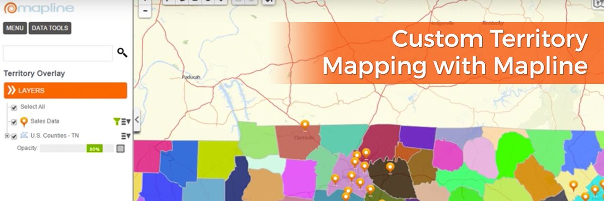
Custom Territory Mapping with Mapline

Mapline offers a lot of fantastic features to help you analyze your Excel location data. One of these features is territories. With Mapline, you have the option to use a multitude of existing territories as well as creating custom shapes on your map. Want to understand the advantages of each of these methods? We’ve got you covered.

Available Existing Territories – How to Use Territory Mapping Software

Mapline offers territories for dozens of countries, from Afghanistan to Zimbabwe and everything in between. You’re able to select your chosen country or continent and narrow down from that level. Examples of existing territories include: Australian local government areas, postal codes, states and territories and suburbs; China provinces; UK counties, countries, postcode areas, postcode districts and regions; and US zip codes, Census tract maps, congressional districts, area codes and school districts. Find a full list of Mapline’s available territories here. As you can see, territories vary widely. Using our existing territories is best when you want to analyze your company’s location data in relation to your customers’ own lives and reality. For example, if you want to understand demographic factors associated with customers, you might plot customer addresses and overlay a territory as broad as states or as granular as US Census tracts to view distinct groups of populations and analyze their behavior.

Draw on a Map for Custom Map Making

If, however, you wish to analyze data based on your company’s own indicators, you can use our custom territory mapping to draw a circle on a map (or square or other shape – including irregular shapes) to represent your internal boundaries or delineated sales territories. You’re also able to click on your shape to then see a list of all the addresses located within the shape. This feature is especially helpful for analyzing sales territories to determine reps’ workload and distribution of both clients and sales personnel. And there you have it – when to use existing territories and when it’s best to draw on a map to create your own custom shapes. It’s that simple! Want to know what else you can do with Mapline? Browse our features.

Measure and Export Distance Between All Locations in Two Datasets

Simple distance analysis

Mapline is making it a whole lot easier for you to find out exactly how far apart locations are. You can easily add two datasets to Mapline and then export the straight-line distance between all locations in both of these datasets. Once downloaded, the Excel spreadsheet will contain the 2 datasets that you chose. The first one is along the side as rows, while the second dataset goes along the top as columns. The distance between any two locations is shown where the column and row intersect.

Steps to measure and export the distance between all locations in two datasets

 
  1. Open your map.
  2. Click “Tools.”
  3. Select “Distance Grid.”
  4. Select the two datasets and your preferred units.
  5. Click the “OK” button to export the distances between all locations in datasets (A) and (B).
Ready to discover how easy it is to map the distance between two locations. Click the button below to get started