
How to Run Analytics on a China Province Map
Make Data-Driven Decisions for Your Business
Take your China province map on a whole new level of analysis using advanced mapping software. Plotting your Excel data on a province-based territory map is just the start of data analysis. Customize your map pins like setting the colors, shapes, and sizes, to quickly convey information. Add labels to identify your pins. This way, you will get drowned by hundreds or thousands of pins.
When mapping provinces of China, you can apply heat maps to see the concentration of your data. Heat mapping is a sure way to identify areas where your business is thriving while showing areas where your business is not doing so well. It detects patterns and relationships that connect your business to the real world. When you have a deeper understanding of data workflow, you can make better data-driven decisions.
Start Data Analysis in Minutes
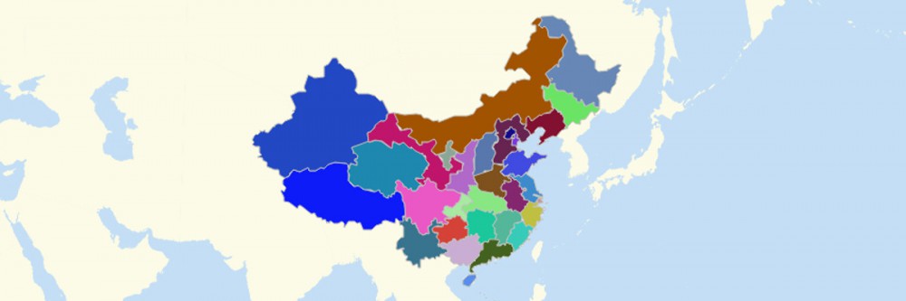
There are only 10 simple steps to follow when creating a province map of China. After carefully following this guide, you can start running data analytics.
- Create a Mapline account and login.
- Click the orange “Add New Items” button.
- Select “New Map” on the drop down arrow.
- Give your map a name and click “OK.”
- Click the “Add” button from the left sidebar.
- Select the “Territories” option.
- Click “From Mapline’s Repository.”
- From the “Territories” select “China Provinces.” Use the search bar for quicker results.
- Select how you want your boundaries to be colored in “Fill Color” (Random Colors, Uniform Color, or Custom colors from spreadsheet).
- Click “OK.”
Make informed decisions using a China province map. Sign up now to get the most powerful data analytics and visualization.