
4 Reasons Why A US MSA Map is The Perfect Map for You
Understand a US MSA Map Better with Mapline’s Territory Mapping Software
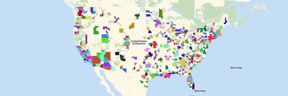
The US has an estimated population of over 332 million people spanning all over 9.834 million km² land. With that vast population, different organizations are looking for more specific ways to divide the population into more defined clusters. That’s why they turn their attention to the US MSA map. It is a map that contains all the 392 Metropolitan Statistical Area boundaries – 384 in the United States and 8 in Puerto Rico.
But what exactly is a metropolitan statistical area map? What insights can we get from learning about MSA? How can we put into practice the insights uncovered? This article will help you to draw a vivid picture of the territory boundary and how it can be used for different significant purposes.
A CLOSER LOOK AT A MAP OF METROPOLITAN STATISTICAL AREA (MSA)
The first thing we need to know about MSA is that it was the US OMB (US Office of Management and Budget) that delineates the areas. The metric they followed is that the area should have a population of 50,000 and has at least one urbanized area. In a more simpler term, it is a region comprising a city and surrounding communities. Cities and counties in a metropolitan statistical area are grouped together for the purpose of population censuses and statistical data.
One significant thing to consider about US MSA’s is that there should be social and economic factors that link the city to its surrounding communities usually in the form of commuting ties.
INTERESTING FACTS WHEN LOOKING AT A US MSA MAP
Not all Metropolitan Statistical Areas are the same. They are each unique in their own ways. Some MSAs may be unique because of their population density. Some are interconnected by famous commuting units. Some are urban metro areas sprawled its way to connecting cities
To give a better idea about some uniqueness of MSAs, here are some maps to show:
US MSA MAP of New York-Newark-Jersey City
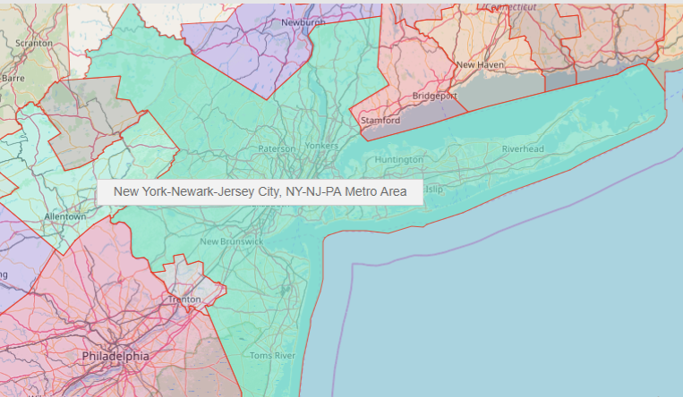
When talking about population, the first thing that pops into mind is New York. After all, the New York Metropolitan Area (also known as Tri-State Area) is the largest and the most populous metropolitan area. It is comprised by 23 counties from New York and New Jersey:
- Bergen
- Bronx
- Essex
- Hudson
- Hunterdon
- Kings
- Middlesex
- Monmouth
- Morris
- Nassau
- New York
- Ocean
- Passaic
- Pike
- Putnam
- Queens
- Richmond
- Rockland
- Somerset
- Suffolk
- Sussex
- Union
- Westchester
The New York-Newark-Jersey City boundary of the metropolitan statistical area is at the top spot when it comes to population density. New York may be a bit cumbersome for statisticians and planners who are looking for ways to organize population centers. The US MSA map showing this MSA boundary may be used for population studies – health conditions, risks, buying patterns, etc.
USA MSA MAP of The Perfect Triangle
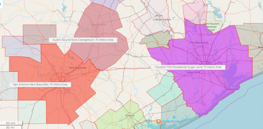
The Texas Triangle is considered to be the model when it comes to the ideal clustering of cities in the metro. It is made up of 9 Metropolitan Statistical Areas:
- Austin–Round Rock–San Marcos
- Beaumont–Port Arthur
- College Station–Bryan
- Dallas–Fort Worth–Arlington
- Killeen–Temple–Fort Hood
- Houston–The Woodlands–Sugar Land
- San Antonio–New Braunfels
- Sherman–Denison
- Waco
Notice that the counties are bound together by major interstate highways (Interstates 10, 35, and 45) making commuting accessible to the general public thereby allowing them to move from urban to rural areas. Aside from demographic studies, the Texas Triangle is used to study economic growth and opportunities.
US MSA MAP of Salt Lake City
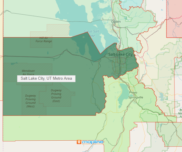
The Salt Lake City MSA located in the state of Utah is considered to be a city cluster. It is made up of the counties of Salt Lake and Tooele. MSAs such as this are being used to study urban structures, employment, and commuting patterns. Because neighboring cities are clustered together, there are studies on dividing the region into different statistical areas. Then again, other factors are to be considered.
WHO USES A MAP OF METROPOLITAN STATISTICAL AREA?
Basically, anyone! Here are a few examples:
Government Offices
The Bureau of Labor Statistics (BLS) is probably one of the best examples of an organization that uses an MSA map. They often use it mainly to analyze labor market conditions within specified metropolitan areas. Different government offices also review MSA information when it comes to per capita income and unemployment rates. Such information is vital when constructing policies for economic growth.
Business Sector
However, population and demographic research and studies are not limited to government offices. Many private companies also use the US MSA map for different analytical purposes. One of which is the business sector. Studying the metropolitan statistical area enables many businesses to look for the best sites before establishing their stores. In turn, job seekers and workers also refer to an MSA map to look for new opportunities without moving to new locations. Thus, securing a solid labor force within the metro.
Health Sector
A metropolitan statistical area map is a significant tool for the health sector. Many hospitals and healthcare companies use the map to identify regions with a high number of cases of illnesses, say, COVID-19. They also use the map to maximize the use of commuting factors to deliver their services fast.
Real Estate
Because a metropolitan statistical area map shows regions, real estate investors use it to capture housing trends and demographic insights. The insights are used in promotion and advertisement of properties that may bring a big impact to buyers.
Top 4 Reasons Why a US MSA Map is The Perfect Map for You
Looking at the maps and examples above, you may think twice about using county boundaries or city boundaries for your territory maps. When doing specific territory and target market analyses, most probably what you’re looking for is the metropolitan statistical area boundary.
The good news is that Mapline’s Territory Mapping Software provides a boundary of metropolitan statistical areas that you can readily use! We can go on and on and discuss how your US MSA map can look more attractive when using the powerful tools of Mapline. But here are just the top 4:
TOP 4 REASON
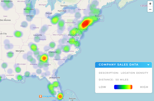
Because Mapline provides advanced heat mapping capabilities, users get more excited than challenged to create region-wide business plans. Both government and non-government institutions are able to use a US MSA map especially when planning for regional activities to expand gross metropolitan products. They may come up with solutions for sustainable economic growth such as provision for high paying sustainable jobs.
TOP 3 REASON
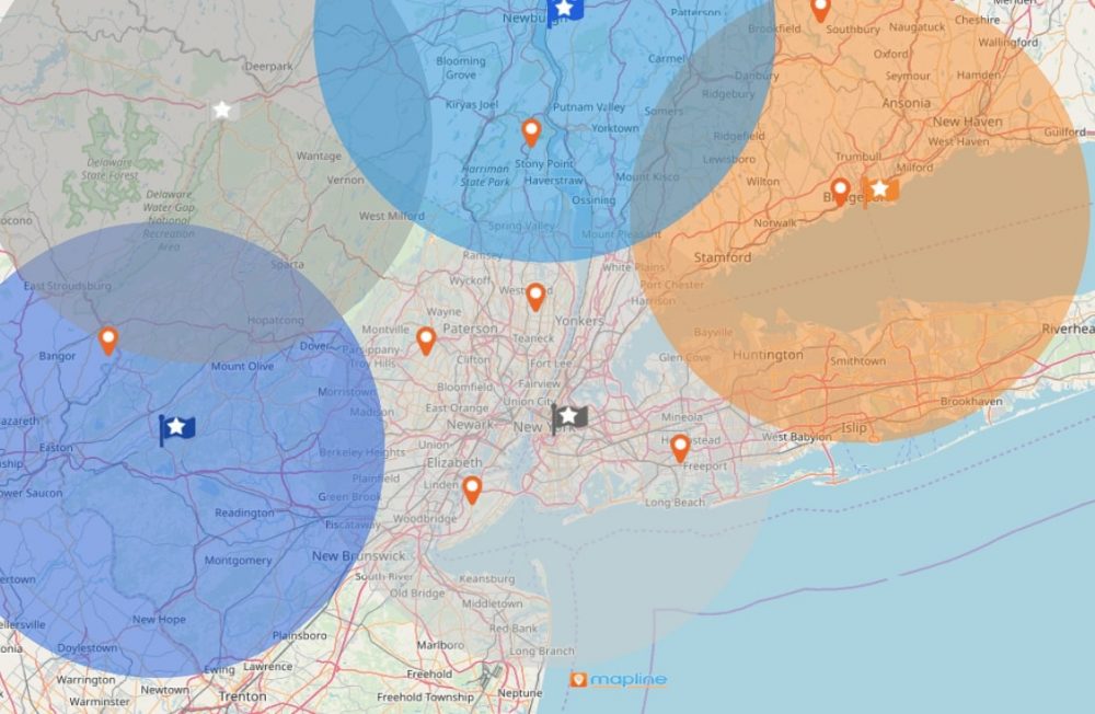
Mapline has a data filter capability that helps organizations to review energy, technology, and growth potentials of cities within the MSA region. Its dynamic filters allow the users to analyze one data at a time, or compare data to understand certain indicators for economic growth. Dynamic filters also help measure the region’s performance and compare it to other MSA.
TOP 2 REASON
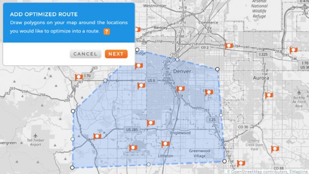
Mapline’s advanced route planning software is often used when creating plans for routing. Many industries have been reaping a great deal of benefits when incorporating Mapline’s route planner on their US MSA map. That includes first emergency responders, law enforcers, fast food chains, logistics companies, etc.
TOP 1 REASON
The territory boundaries of MSA can be mapped in seconds! Yes! You read it right – seconds, not minutes!
Metropolitan Statistical Area boundary is available within Mapline’s Repository. All you need is a few clicks and voila! You now have it overlaid on your data map. For instance, you may want to create a map of the Texas Triangle? With Mapline, all it needs are just 9 Metropolitan Statistical Area boundaries and bam! You have your Texas Triangle map. It is very time consuming to upload 66 counties just to create a map of the Texas Triangle. Whereas when you use the MSA boundary, it only takes a few seconds. The time you save in plotting the territory boundaries can be spent more in data and territory analyses.
STEPS TO CREATE A US MSA MAP
- Create a Mapline account and login.
- Click the orange “Add New Items” button.
- Select “New Map” on the drop down arrow.
- Give your map a name and click “OK.”
- Click the “Add” button from the left sidebar.
- Select the “Territories” option.
- Click “From Mapline’s Repository.”
- From the “Territories” select “U.S. Metropolitan Statistical Areas.” Use the search bar for quicker results.
- Select how you want your boundaries to be colored in “Fill Color” (Random Colors, Uniform Color, or Custom Colors from spreadsheet).
- Click “OK.”
There are more great reasons for using a US MSA map with Mapline’s Territory Mapping Software.
Utilize more territory mapping tools to experience the full advantage of metropolitan statistical area map:
- Mapline Automate
- Mapline BI Dashboard
- Customize Territories
- Color-Coded Territories
- Customize Map Pins
- Data Segmentation
- Radial Heat Map
Sign up now and enjoy the Mapline advantage of territory mapping – with a purpose!