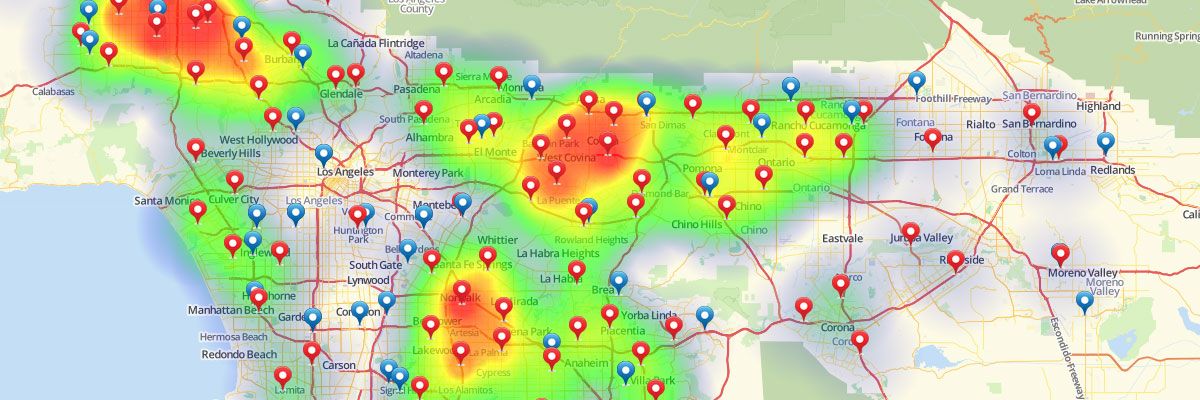
Using Radial Heat Maps
Visualizing Your Data with a Geographic Radial Heat Map
Radial heat maps look like weather radar and show color coded concentrations of your data. With radial mapping software options you’re not only able to visualize your data on a map but you can also easily and immediately understand where the majority of your activity is located. By presenting more densely populated areas in one color and sparser locations in another from the gradient, Mapline makes analysis of your data simple, whether you’re mapping customers, sales or other calculations from your spreadsheet. You can view heat map overlays with your data pins and you’re also able to hide the pins for a clearer picture.Steps to overlay a radial style heat maps
- Open your map.
- Click the drop down menu next to your dataset.
- Select “Heat Map.”
- Select whether you would like to apply the heat to the area around the pins or the overlapping radius areas.
- Define the radius (miles or kilometers).
- Select whether you would like the heat map to be based on location density or the sum or average of your data.
- Click on the “Styling” tab to set the opacity and blur. You can also remove the legend and fade the edges of the heat map.
- Click “OK.”
- Click the pin icon on the left sidebar.
- Select “Style.”
- Select the “Hide Pins” option at the top right.
Ready to use our radial mapping software? Check out our plans and pricing to find the right option for you.


