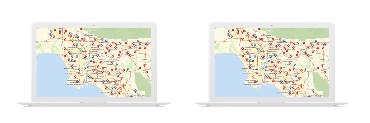
Mapline offers a wide range of territory boundaries which can be added to your map. See Mapline’s Available Territories to see what is offered as well as step-by-step instructions on how you can add them to your map or build heat maps.
How to Map Sales Territory Reports
Increase Visibility into Your Sales Performance
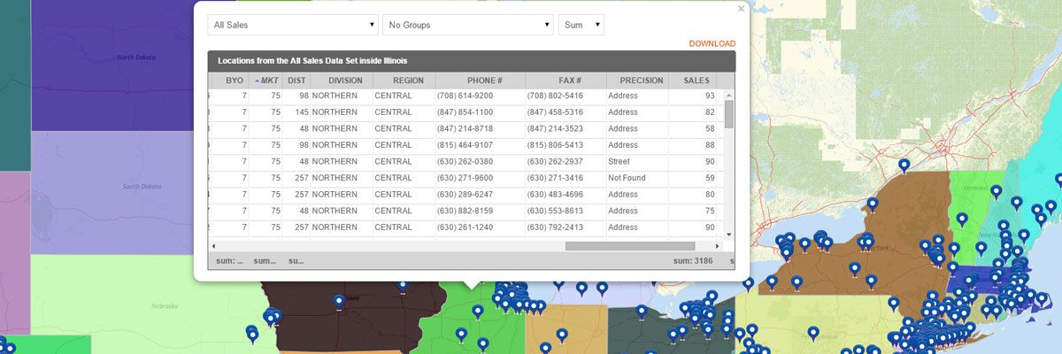
Sales territory reports provide full visibility into your sales performance you don’t get when looking at numbers in a spreadsheet. Sales summary maps created with our territory mapping software include:- Measurements – the shape of the territory, number of sides, area, and center coordinate
- Summary of All Data – summary of all data sets inside the territory which include name, location count, midpoint, and center of minimum distance. If you have sales numbers in your pins, then you can see the total or average sales for each territory.
- Export option – to download the territory report.
Steps for How to Create a Sales Summary Map
Creating a sales summary map is easy. Just build your map and place your sales data pins on the map. Then, overlay the territory you would like to view. To access the territory report:- Hover your mouse to a specific territory and click it.
- Your territory report will appear.
- Click the “Download” link.
That’s how easy it is to see territory performance reports! You can also create a heat map of your territories to visualize the performance.
Start Mapping TodayHow to Create a Map with Segments
Group Pins on Your Maps for Better Insights
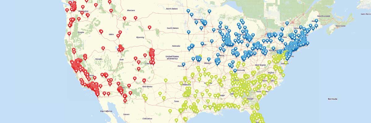
Specifying locations with pins helps you identify trends and outliers, but what if you’re looking at too many locations at once? All that data viewed at once can get confusing and start blending together. With the segment feature, you can categorize your pin segments and narrow in on what you actually want to look at. Follow our step-by-step instructions to add segments to your maps where you can visualize customer segments, location types, regions, and more.Steps to add Segments to your map
- Create a new map and add a dataset on your map.
- Click layer options menu next to the layer on your map.
- Select the “Segment” option.
- Click the “Add tier of segments” button.
- Select the category from your Excel spreadsheet that you would like to use as categories on your map.
- Click Done.
That’s all it takes to group your pins and assign different icons for different groups of locations!
How to Draw Shapes on Your Territory Maps
Customize Your Territories for Your Specific Needs
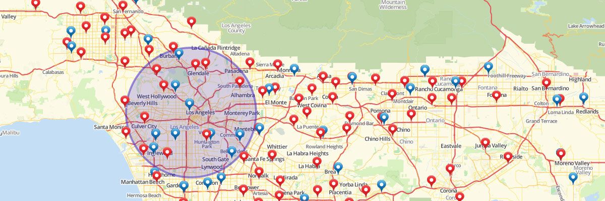
If you have territories that are unique to your company and don’t quite match up to existing shapes, you can plot shapes on a map to meet your individual needs. With Mapline’s Draw Pad feature, you can quickly draw custom territories and shapes on your map. Once shapes are created, you can get a list of locations inside the shape and export them for deeper analysis.Steps to Draw Custom Shapes in Your Territory Map
To plot shapes on your map:- For circles and squares, just click on the map to create the shape where you want.
- For polygons and other custom shapes, click on the Draw Polygon button.
- Click to begin drawing your shape around the pins on your map.
- Click around all the pins you want to include to make the shape bigger.
- Click on the first pin you’ve drawn to close the shape.
- To include pins outside of your shape, click on the Edit button.
- Hit Save when you finish creating the shape.
- To change the color of the shape, click on the Paint Bucket.
- Click on the Fill Color and choose the color you want from the color spectrum that appears.
- To get more information about the pins within your shape, click within the shape.
- After clicking, you’ll see square mileage of your shape and a summary of all the data points inside the shape.
- Download the summary and location reports to use for further analysis.
Using Radial Heat Maps
Visualizing Your Data with a Geographic Radial Heat Map
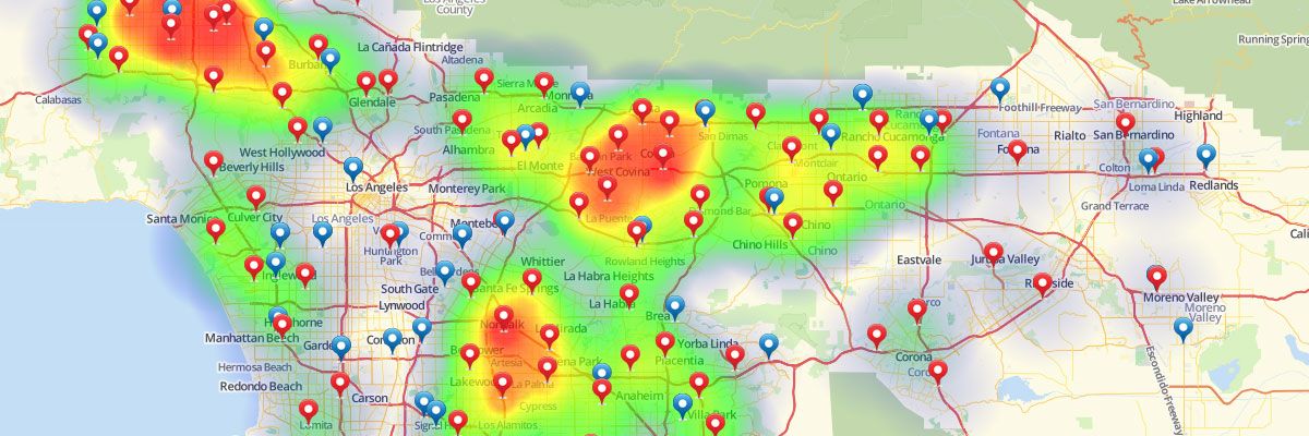
Radial heat maps look like weather radar and show color coded concentrations of your data. With radial mapping software options you’re not only able to visualize your data on a map but you can also easily and immediately understand where the majority of your activity is located. By presenting more densely populated areas in one color and sparser locations in another from the gradient, Mapline makes analysis of your data simple, whether you’re mapping customers, sales or other calculations from your spreadsheet. You can view heat map overlays with your data pins and you’re also able to hide the pins for a clearer picture.Steps to overlay a radial style heat maps
- Open your map.
- Click the drop down menu next to your dataset.
- Select “Heat Map.”
- Select whether you would like to apply the heat to the area around the pins or the overlapping radius areas.
- Define the radius (miles or kilometers).
- Select whether you would like the heat map to be based on location density or the sum or average of your data.
- Click on the “Styling” tab to set the opacity and blur. You can also remove the legend and fade the edges of the heat map.
- Click “OK.”
- Click the pin icon on the left sidebar.
- Select “Style.”
- Select the “Hide Pins” option at the top right.
Ready to use our radial mapping software? Check out our plans and pricing to find the right option for you.
How to Share a Map
Trying to share files through email chains becomes confusing and disorganized. What if you’re sending multiple versions of data sets, and your colleagues or clients happen to open an older version? After you create a map with Mapline, you can also share those maps in real time with your teammates, colleagues, clients, and customers. No back-and-forth emails, no tracking down the “latest copy,” and no special software or downloads are required! Follow our step-by-step instructions on how to share a map online.
Steps to share a map
- Open your map.
- Click “Options.”
- Select “Share.”
- Enter the email address of the person with whom you would like to share your map.
- Click “Share.”
- Select if you would like to share the dataset information with that person.
- An email will be sent to the user inviting them to sign in to see the map you have shared with them. If they are not a registered user, they will be required to register using the same email address as the one you shared your map with.
- Add more email addresses if you want the same map to be shared to more recipients.
That’s how easy it is to share a map with your team. Just enter their email and let them enjoy the map themselves. Sign up now to give it a try!
- 1
- 2


