
Generate Intelligent Sales Forecasts with Market Demographics
- How To Guide
- Generate Intelligent Sales Forecasts with Market Demographics
Seeing the future is every sales team’s dream. Predicting market trends and sales performance can sometimes feel like an unattainable superpower.
But in reality, that power is right at your fingertips! Keep your sales team ahead with spot-on sales forecasts using historical stats, real-time data, market demographics, and more! Build a laser-focused system that combines all your location data to generate rich insights. This empowers you to align your strategic business goals with real-time data that propels your team to new heights. Then, perform scenario analyses and what-if simulations with ease and gain the clarity to effectively allocate resources and manage your budget.
It’s like having a crystal ball for your sales strategy. Every decision is backed by accurate, up-to-date information.
Best of all, you can pivot on demand, so your team never misses a chance to dominate the market. So, let’s dive in and transform your sales forecasting! Get ready to empower your team, boost efficiency, and maximize ROI like never before. Trust us, this is one adventure you won’t want to miss!
IMPORT HISTORICAL DATA
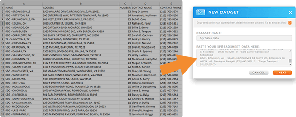
First, import the historical data you’d like to factor into your forecasts. This can include:
- Deal size
- Lead cost
- Conversion rates
- Customer segments
- Commissions + bonuses
- Sales activity data
- Time to convert
- Lead quality
- ROI
This data can be pulled into your Mapline visualizations to empower you to compare and contrast key metrics and reveal new insights about your sales, operations, and customers.
CALCULATE TOTALS, AVERAGES, & MORE
To generate an accurate forecast, you’ll need to know some very specific metrics. These can include:
- Average number of touch points
- Average conversion rate
- Average deal size
- Average lead cost
- Average churn rate
- Average ROI
- Pipeline coverage
- Total paid commissions
- Total referral bonuses
- Total mileage driven
Averages are a fantastic way to discover which factors really impact your bottom line. Here’s how to quickly calculate averages, totals, or any other formula you need.
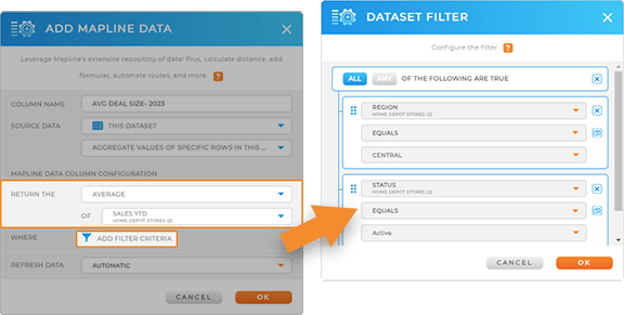
Let’s calculate your average deal size from the past year. With your dataset open, click the MAPLINE DATA icon in the top menubar. Name your new dataset column AVG DEAL SIZE- 2023 and select THIS DATASET as the source data.
For the calculation type, select AGGREGATE VALUES OF SPECIFIC ROWS IN THIS DATASET. Then, click the RETURN THE drop-down and select AVERAGE.
Select the dataset column for which you’d like to take the average–in this case, DEAL SIZE– then apply any necessary filters, such as the region or division you’d like to run this calculation for. When you’re done, click OK.
Now, you can see the average deal size by area! That’s one powerful calculation, and it only took a few seconds.
ENHANCE WITH DEMOGRAPHICS
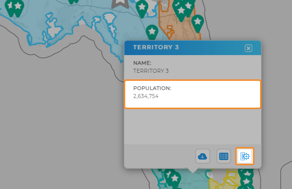
Next, we’ll enhance your analytics even further. Add demographic data to your datasets and quickly pinpoint untapped markets and ideal expansion areas.
This is a fantastic way to inform your next big move, whether it’s opening a new location, hiring a new sales rep, or testing the waters in a new market.
Once you have the data you need, you can visualize it on your map pop-out bubbles or leverage it when creating new territories. The possibilities are endless!

Pro Tip: Segment your audience to compare your existing market segments against demographic data. This is a powerful way to hone in on your ideal audience and make truly data-driven decisions with your team.
COMPARE AND CONTRAST
Now, you’ve laid the foundation to take your sales forecasting to the next level. You can visually compare your historical data with real-time data by customizing your charts, reports, or maps to display whichever metrics you need. Let’s explore how to build custom visualizations for your sales forecasting and enable your team to plan and strategize together.
SALES CHARTS
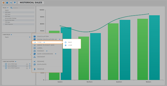
Let’s create a sales chart showcasing your historical sales, YTD sales, and projected sales.
First, add a new chart and name it. Click and drag the field by which you’d like to categorize your data into the X-axis, such as REGION or DIVISION. Then, drag your historical sales data columns into the Y-axis.
If you have a dataset column with projected sales, click and drag it into the Y-axis field. Click the OPTIONS drop-down arrow in your projected sales column, hover over TYPE, and select LINE.
Segment your chart data, or apply any other chart customizations you need, then you’re good to go!

Pro Tip: Automatically collect data from sales reps to feed into your sales forecasts. Ensure that your team reporting collects the metrics you need, such as pipeline stage, lead quality, deal size, and follow-up dates. These metrics will help you visualize progress over time, and adding them to your regular reporting ensures automatic updates with every touch point.
SALES REPORTS
Alternatively, create a report that uses data from your pipeline to forecast quarterly sales revenue.
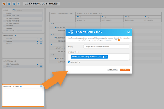
Create a new report and name it. Then, click and drag your desired data into the COLUMNS and ROWS fields. Then, configure your report calculations, such as total projected increase by product. Make any other necessary adjustments to your report, then you’re all set!

Pro Tip: Keep everything in one place so you can focus on crafting data-driven strategies and wowing upper management. Add your visualizations to a dashboard to make it easy to present your findings to your team!
SHARE WITH YOUR TEAM
Once you’ve generated the insights you need, it’s time to share them with your team! Add your new visualizations to a custom dashboard including forecasting metrics that will help you hone in on key insights. In seconds, you can share custom views or dashboards with your team to empower them with the information they need to succeed.
Export or share reports with management in seconds, so you’re always ready to impress the boss and show that you’re on the ball. There’s no better way to ensure that everyone on your team stays informed 24/7.


